
The opportunity
The homepage is the most visited, most judged and most abandoned screen in any app. For a frontline workforce that opens the app between shifts, in low connectivity and limited time - it had to do a lot with very little. The opportunity was to design a space that felt personal, purposeful and worth coming back to. Not just a dashboard. A daily anchor.
Product Strategy
Core UX
UI Developement
TL;DR
Designed and shipped the homepage for the mobile app. Improved engagement and time spent in app by +67% from the legacy version.
Get in Touch
Core MOAT's
Gamifying the entire user journey
Rewards and Recognition
Social Validation and Social Share
Personalisation
Enablers
Incentivise User Behaviour
Show visible progress
Building a community
Excellent Customer Support in-app
Engagement MOATs. Product Decisions
What we built toward, and the calls that shaped how we built it.
Picking a Navigation Model That Scales
The invisible work that makes design matter


HOW DID WE BEGIN?


Daily Action Plan
Quick Access Cards
WIREFRAME STRUCTURE
SOLVING FOR
MULTIPLE FUNCTIONS
Due to the multi-functionality of the app, a grid based modular system helped us -
➤
Subscription features toggled per client, no redesign required.
➤
Personalise user experience for Individuals.
➤
Hub-and-spoke model preserved regardless of configuration depth.
The same homepage grid adapts to any client setup, any subscription depth, without a single layout rebuild.


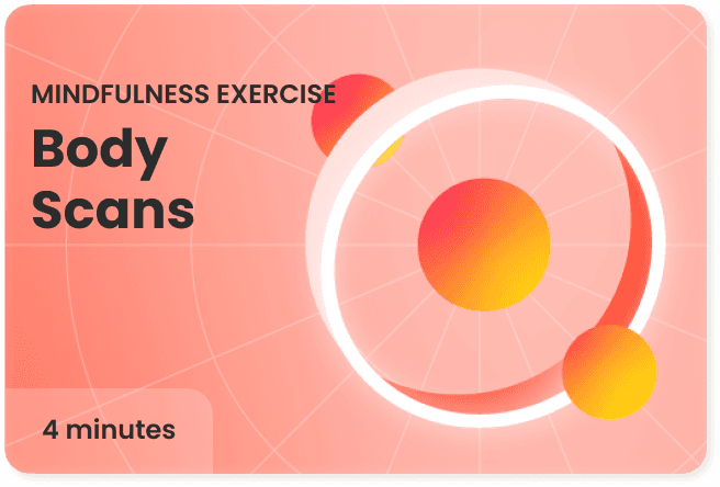


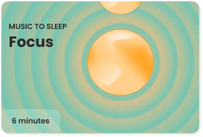


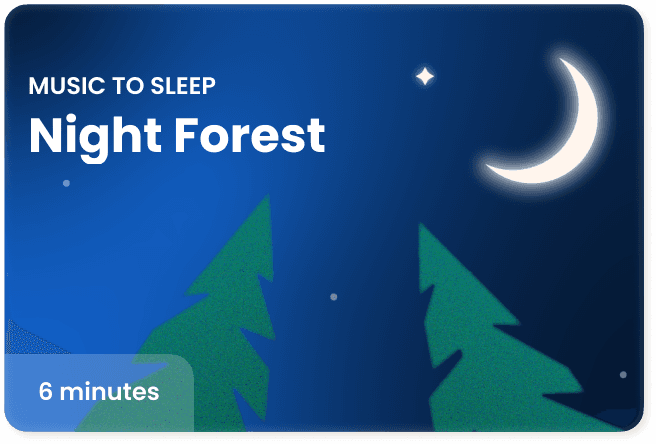


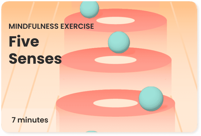


The challenge was to surface personalised interventions without overwhelming the user. I leaned into familiar interaction patterns and gestures to present these interventions and features as intuitively. Each card was individually illustrated to make every intervention feel distinct, identifiable, and worth engaging with.
Building a REWARDS SYSTEM
The reward system was one of the most strategically layered problems we solved. We inherited a broken points system and had to transition existing users without losing their sense of progress - while building something scalable enough to grow with the product.

WHAT CAME NEXT?
The last iteration we were exploring wasn't really a homepage. It was a full-screen, distraction-free view of the user's active DAP task. No cards, no navigation noise. Just the one thing that mattered to them right now.
This is where the work paused. The experiment was live, the questions were forming and I left the role before we had answers.
Open Ended Questions :
Does a focused view increase time to first action, or does it disorient Users who rely on the full surface?
If the homepage becomes task-first, does it improve or drop feature discovery?
Does that matter if task completion goes up?
Does it create a tunnel that reduces cross-feature engagement?

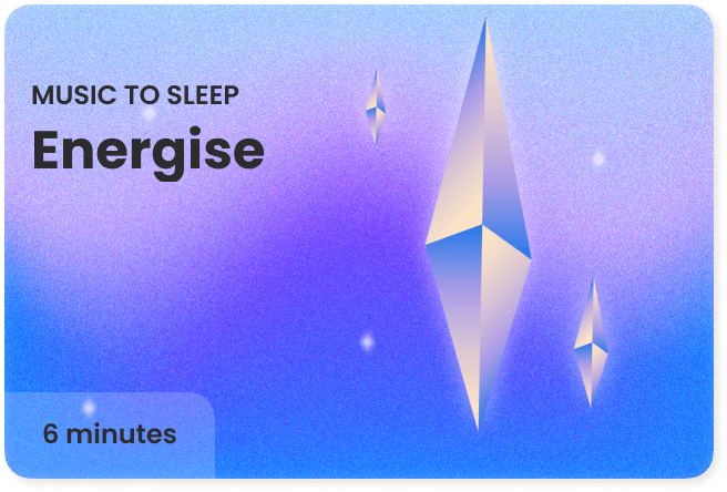
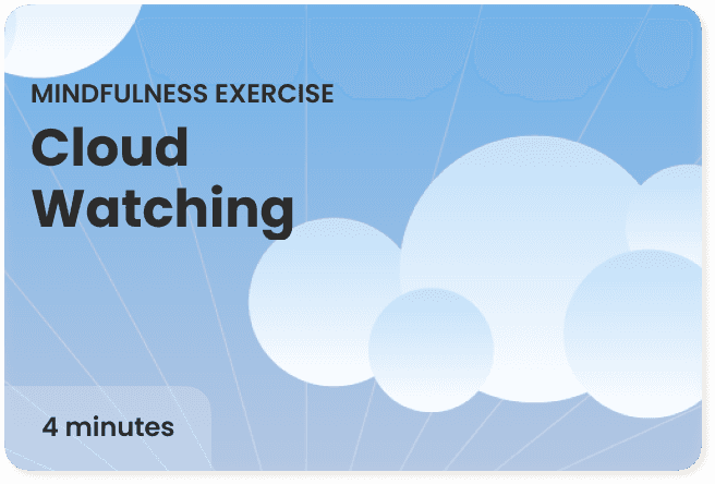
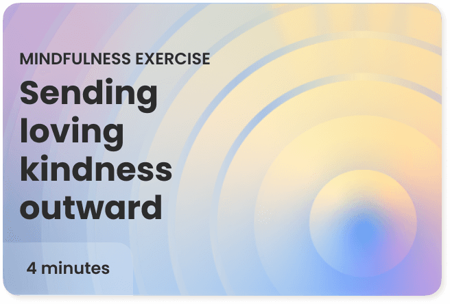
Once the component logic, illustration style, and interaction patterns were in place, every new screen had a clear starting point. A meditation detail, a gamified intervention, a mental health hub. Three different user intents, one coherent design language


